Size and distance
OpenBridge assume a pixel independent format for setting the size of user interface components to make it scaled accurately on all screens.
Reference pixel
Our scaling corresponds to the rules set in the W3C and is based on reference pixels (Px).
"The reference pixel is the visual angle of one pixel on a device with a pixel density of 96dpi and a distance from the reader of an arm’s length. For a nominal arm’s length of 28 inches, the visual angle is therefore about 0.0213 degrees. For reading at arms length (710mm), 1px thus corresponds to about 0.26 mm (1/96 inch).
A reading distance of 71 cm (28 inches) results in a reference pixel of 0.26 mm, while a reading distance of 3.5 m (12 feet) results in a reference pixel of 1.3 mm."
Retrieved 14.11.2019, w3.org
https://www.w3.org/TR/2019/CR-css-values-3-20190606/#lengths
Pixels and millimeters
Recalculate the px values by measuring the actual sizes on the screen that will be used. (Note: The buttons in OpenBridge is 40px plus an 8 px safe frame, making them in total 48px (15mm height) in correspondence with regulation. All touchable components have 48px space.
1px = 0,313 mm
1mm = 3,2 px
40px = 12,5 mm

Responsive principles
The OpenBridge Design System uses standard web responsive principles. Content and containers are stacked differently to fit different screen sizes and formats.
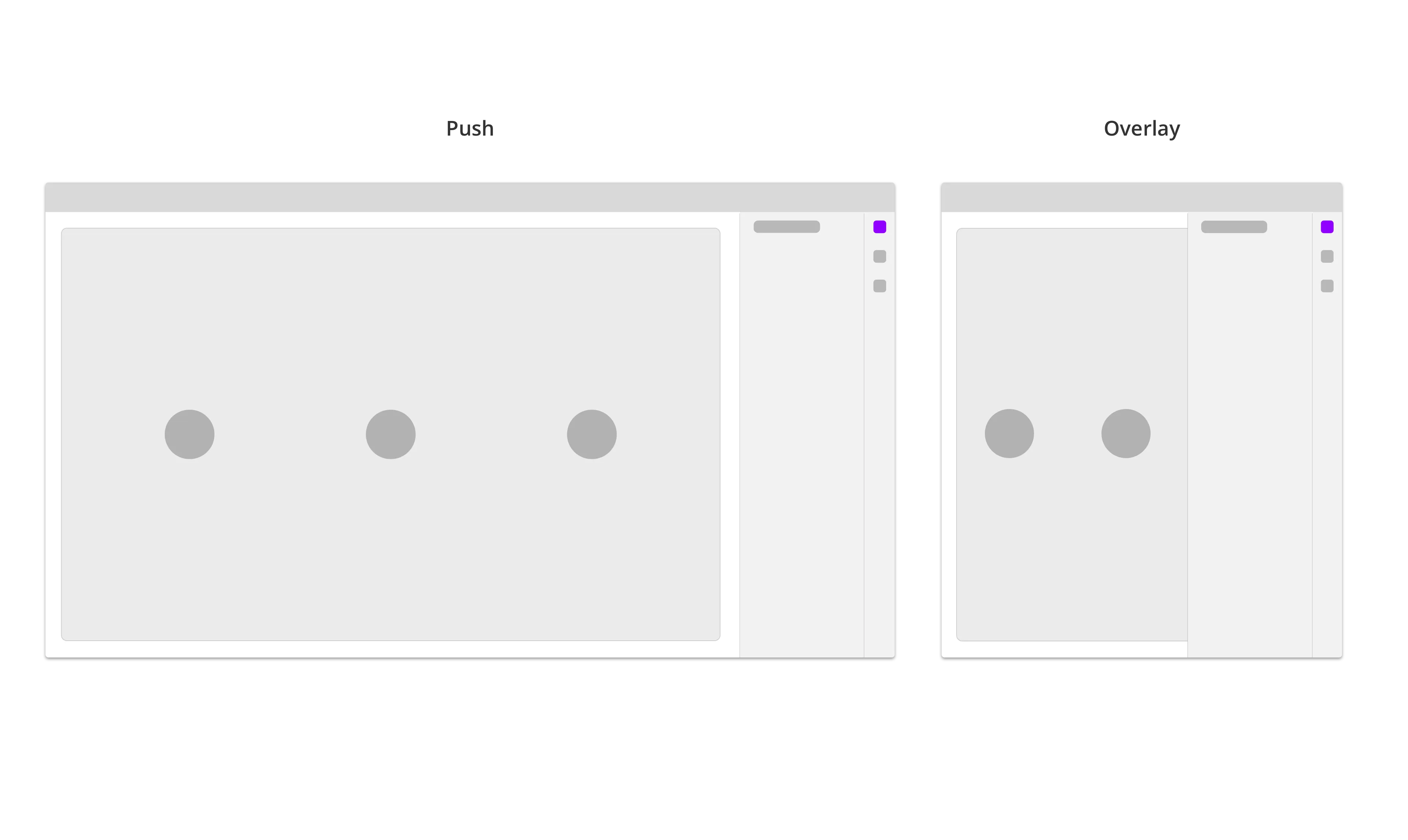
Push vs overlay
The Sidebar will push and resize the page (content) on wider screens. When the screen size is smaller, the Sidebar will overlap the page. On even smaller screens, the sidebar will take the full screen.
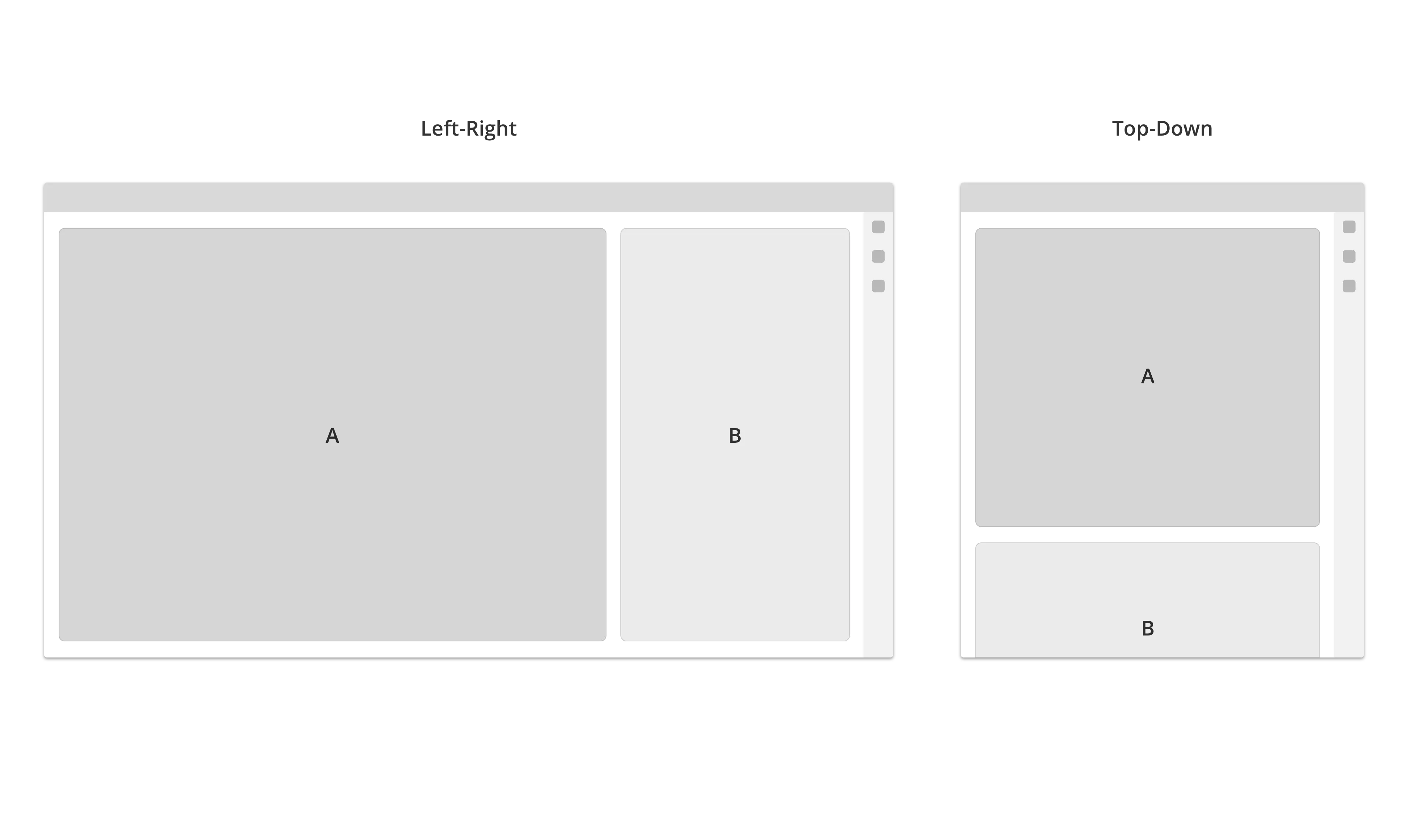
Stack
On wide screens, the content are arranged from left to right. When the screen size get smaller, it will stack the content from top to bottom.
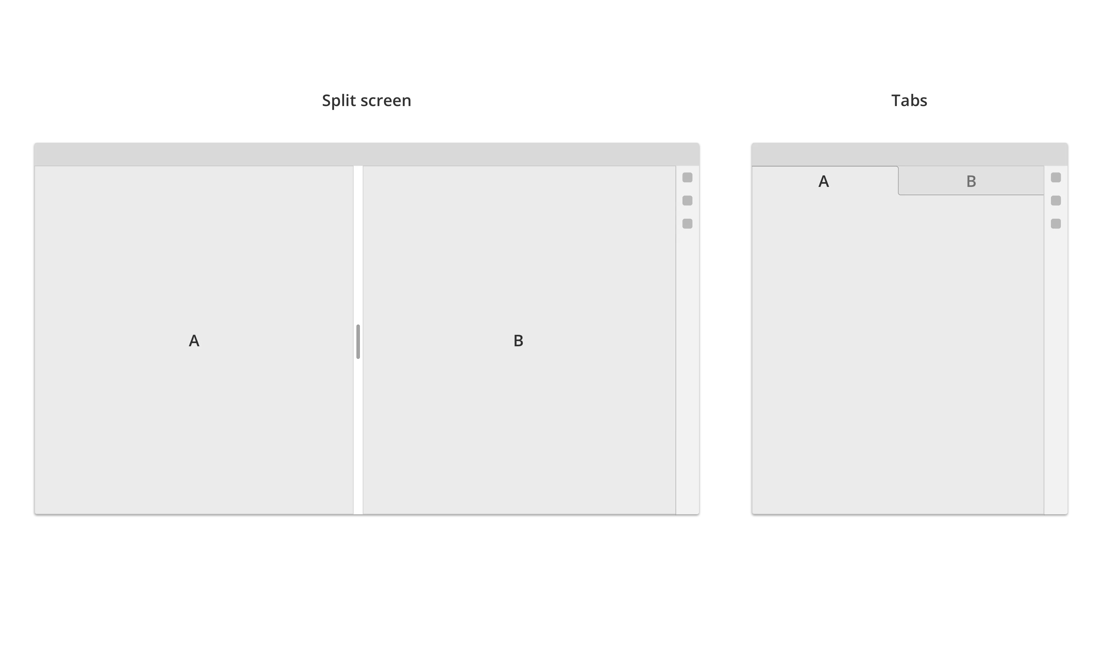
Split - Tab
Pages are usually stacked in tabs, but can also run in split screen on large screen sizes (optional).
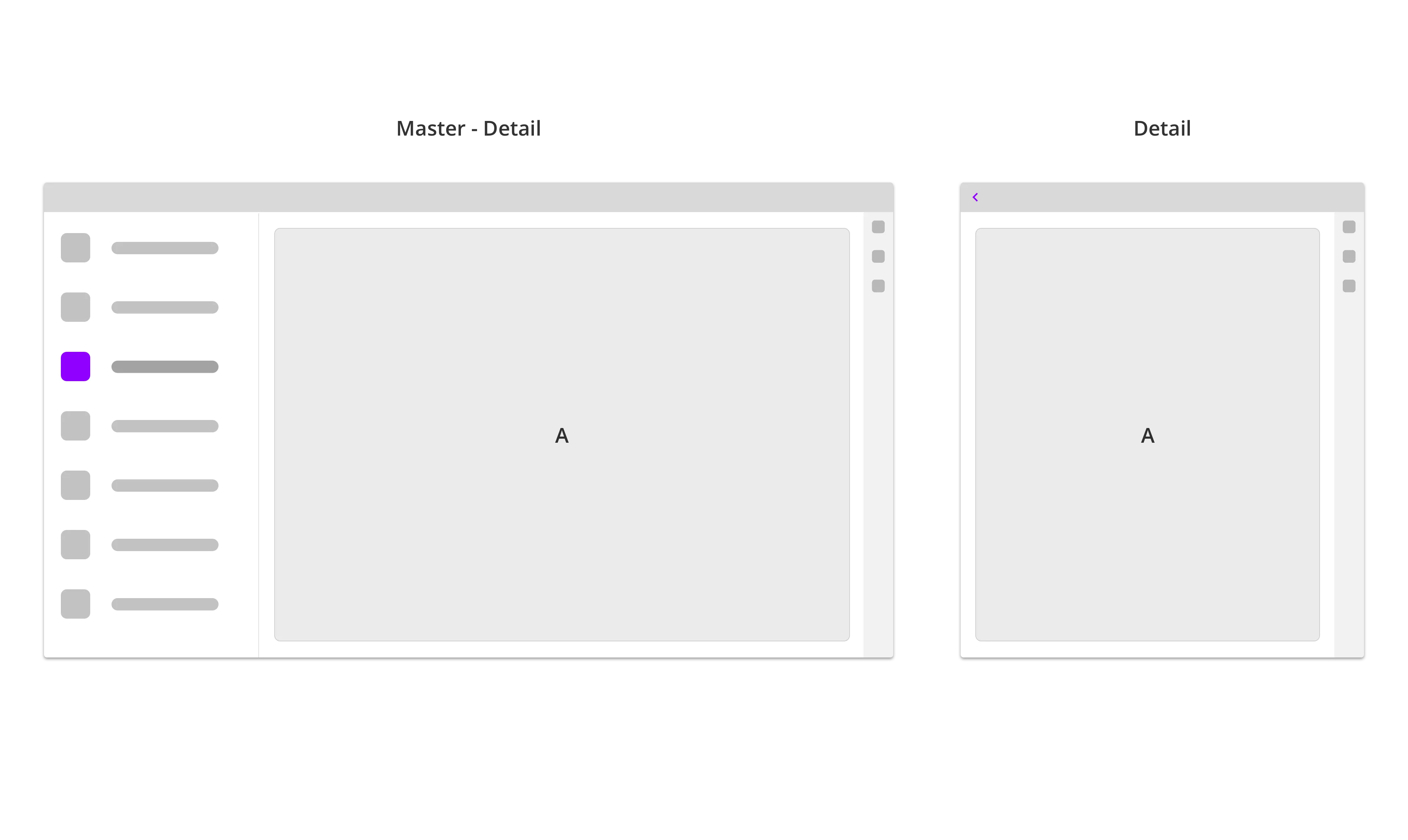
Master - detail view
Sections like Settings are arranged in a Master-Detail structure. On wide screen sizes two or more levels in the Settings-hierarchy are visible and stacked from left to right. When window is resized to a smaller screen, the master page will collapse, and the detail screen will go full screen. If there is three or more setting layers visible, it will collapse the topmost layer first (starting from the left side).