Alerts
OpenBridge offer a comprehensive set of components supporting communication of alerts in applications. The design pattern is designed to work consistently across applications and offer versatile means of communication alerts in order to support different screen sizes and applications types.
Navigation
Alert are visualized using a series of interconnected components such as alert icons, alert badges, top bar components, an alert menu and an alert page. The following section presents the components and how they are interlinked.
No alerts
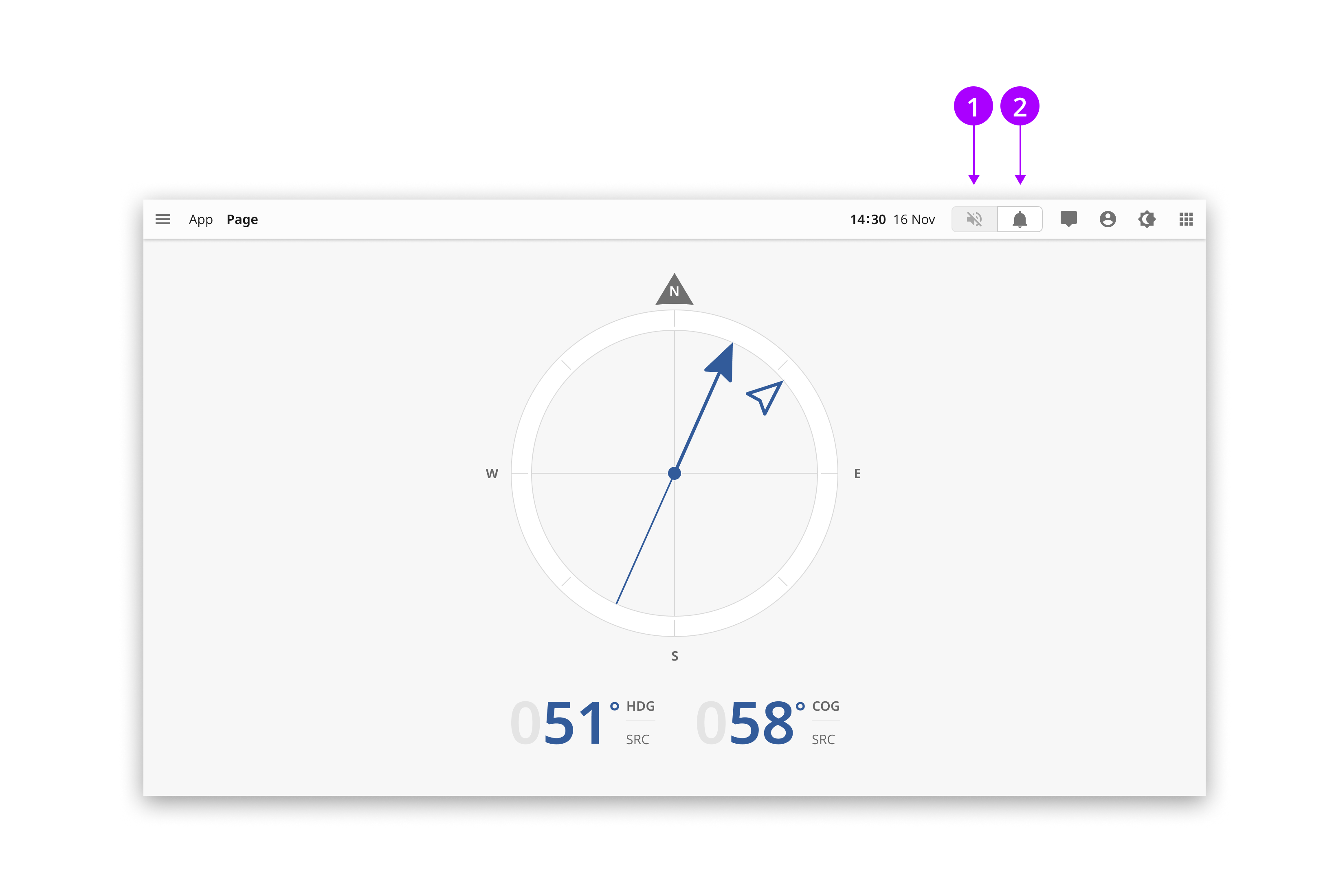
OpenBridge reduses the empasis on alerts elements in the interface when there are no alerts. 1 The mute button are either not present or shown as an inactive supressed button. 2 The alert icon are shown using a supressed button with neutral emphasis. The alert menu can still be accessed through the alert button.
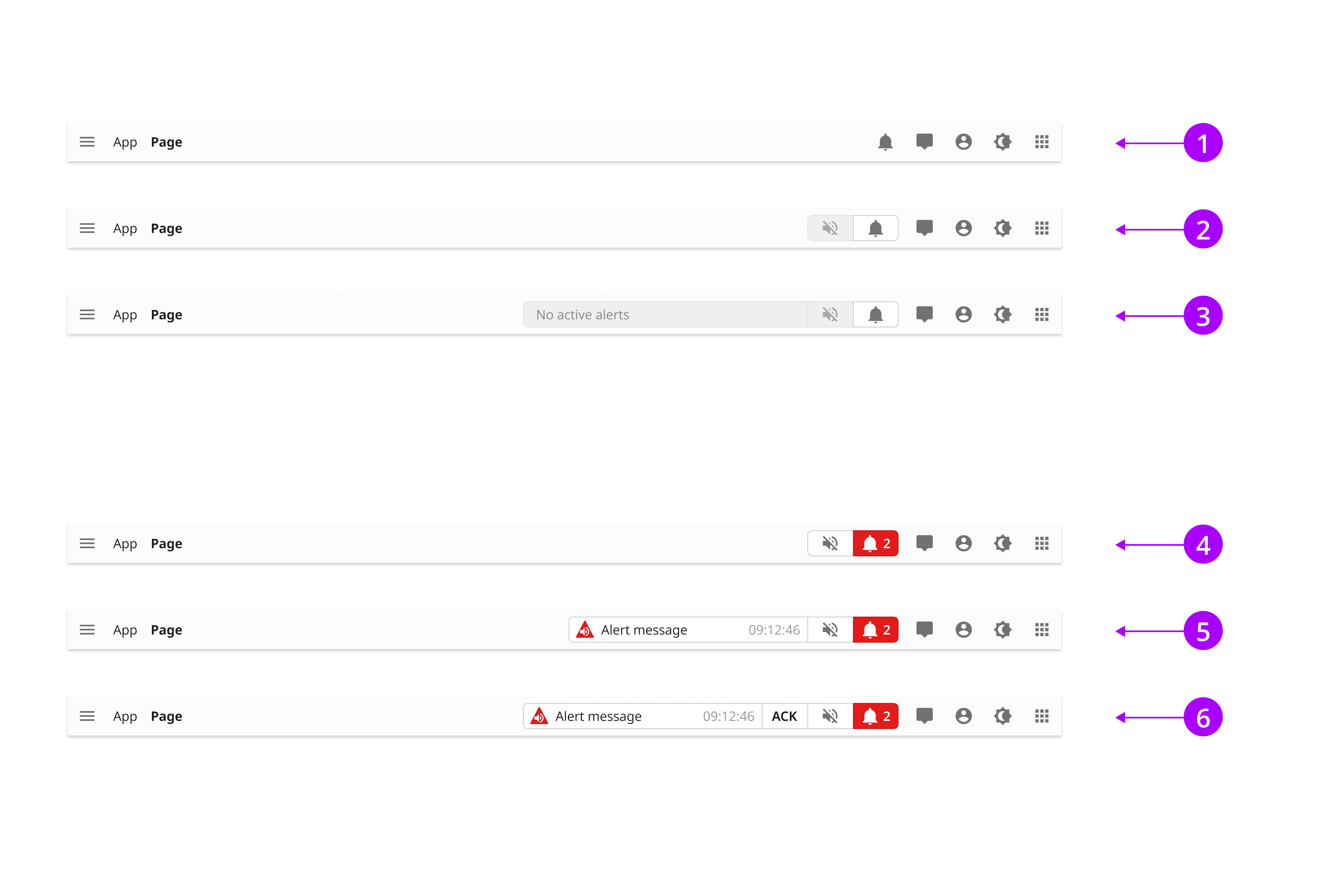
Showing active alerts
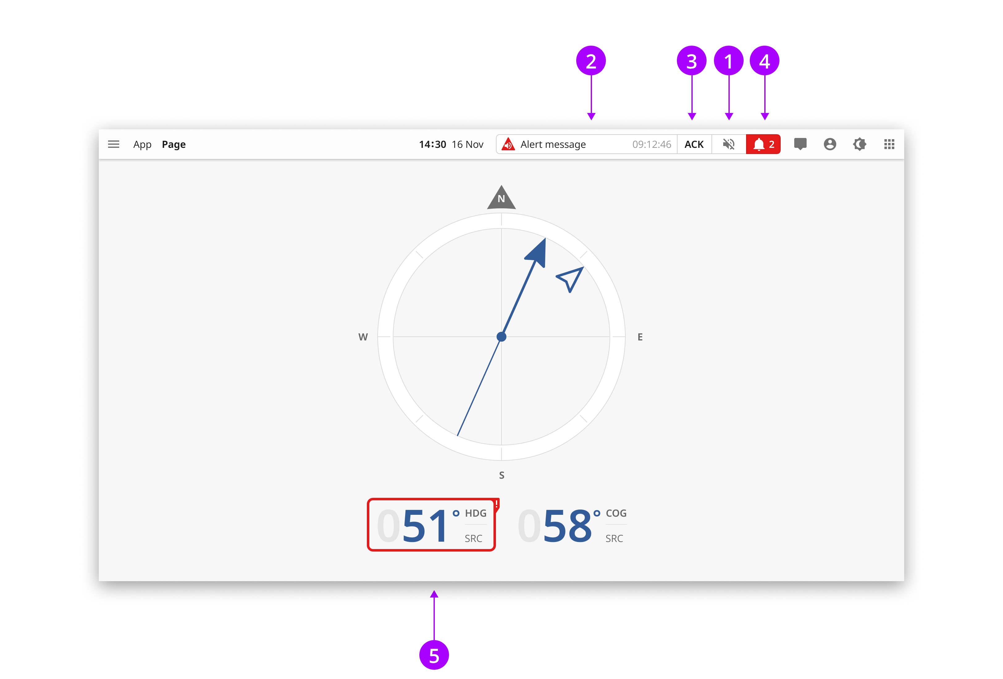
Incoming alerts changes the interface in the following ways: 1 The silence button are shown as a button. 2 An optional alert notification are shown in the top bar. 3 The notification can give access to an acknowledge button when relevant. 4 The alert button are shown as a normal button and shift color to the highest active alert. It may also show alert count. 5 When relevant instrument labels can change color to alert or warning.
Showing alerts in the navigation menu
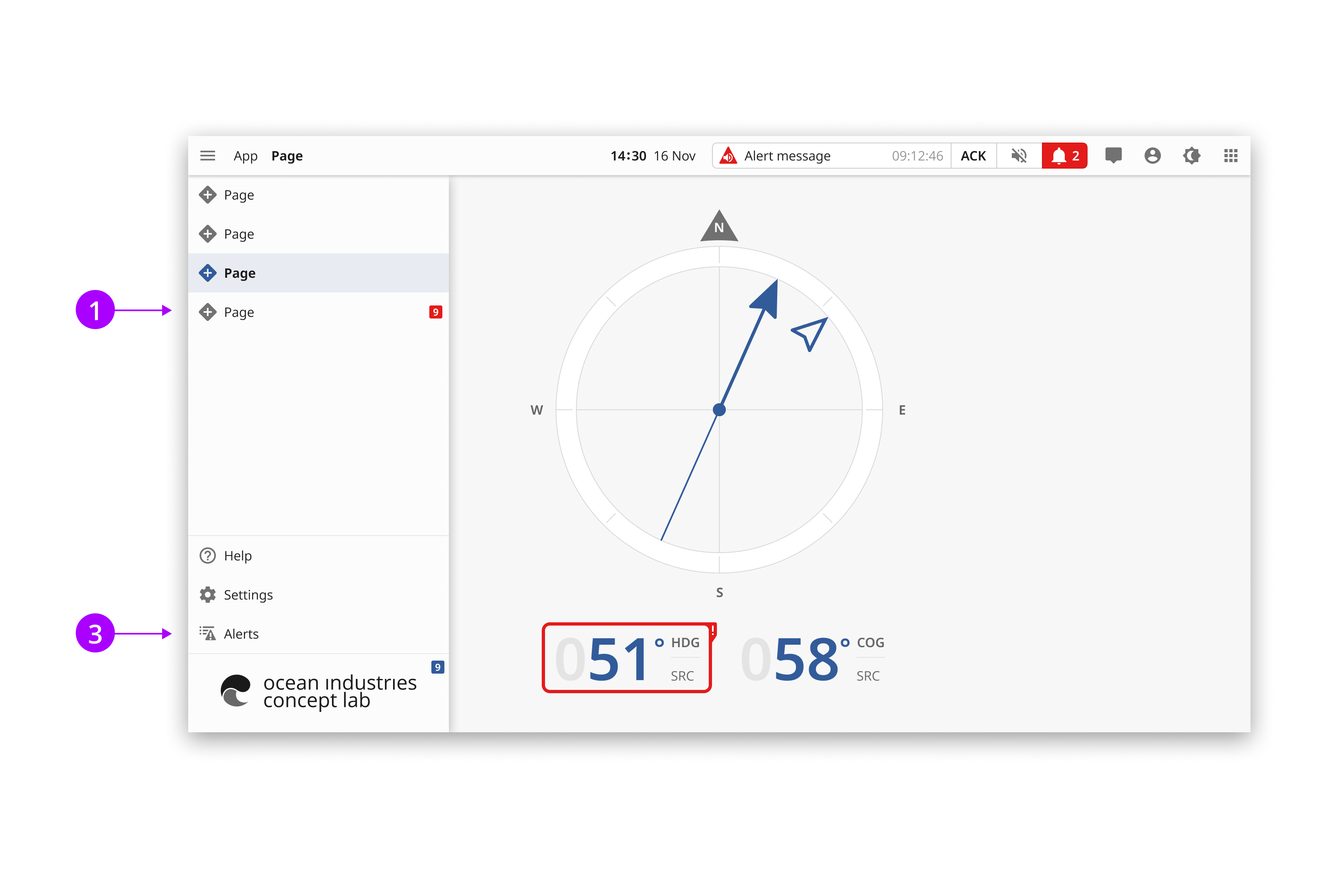
In order to better locate alert source in an application page structure, there is an option to show alert badges inside the navigation menu. The badges can be shown in both the full and the exposed navigation menu. 1 The badge in a top section show the color of the most serious alert and the total number of alerts in this secton. 2 Subsectiosn follow the previous pattern and show the total number of alerts in the sub section. 3 There is a link to the full alert list in the navigation menu.
Top bar options
The needs for showing alerts in the top bar varies according to application types and screen sizes. To account for this we offer a series of components that can be combined and altered according to needs. No alerts: 1 A single alert icon. 2 Alert icon and inactive mute button. 3 Alert icon and inactive alert notification. With incoming alerts: 1 No notification. 2 Notification. 3. Notification with aknowledge.
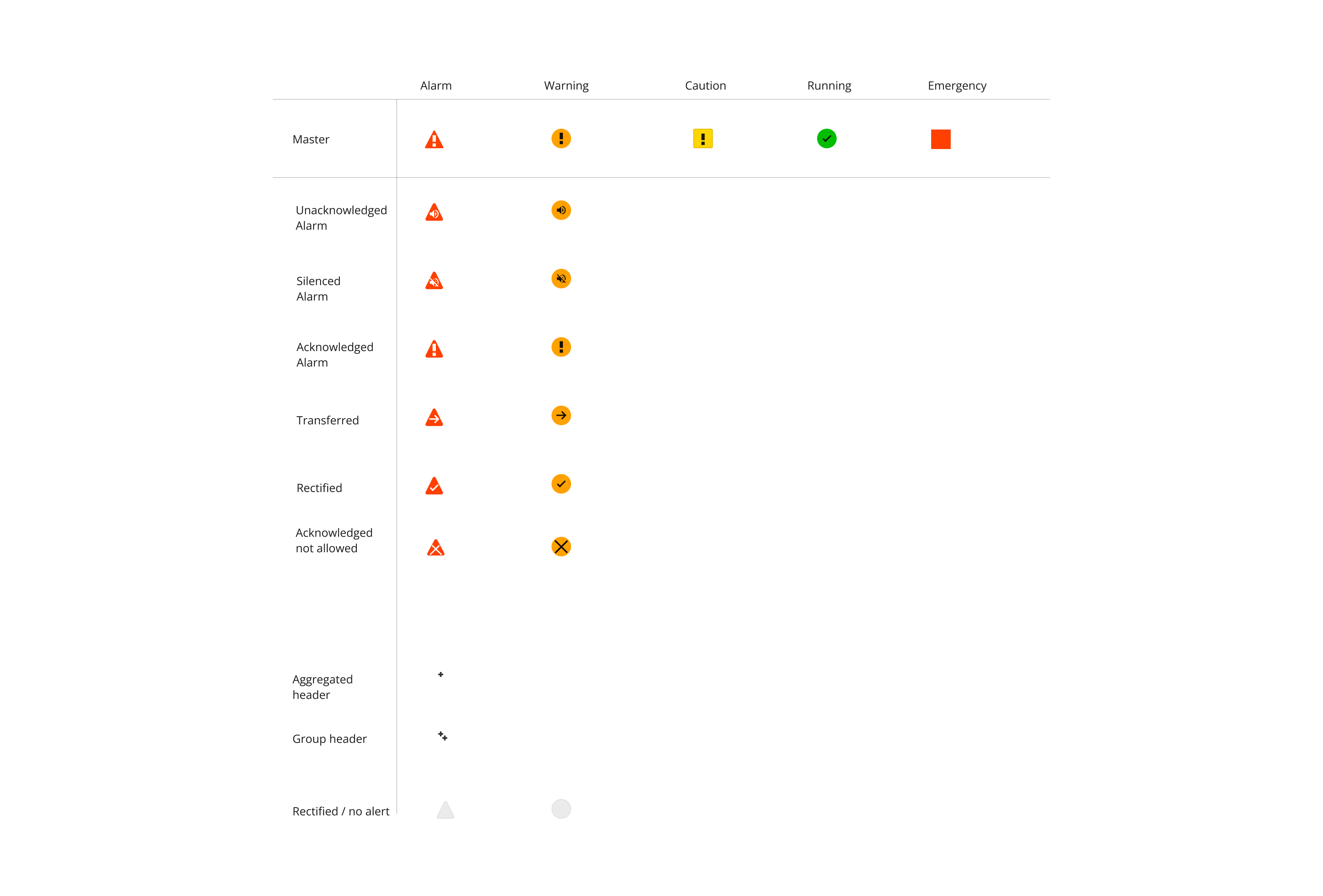
Alert icons
OpenBridge use standard bridge alert management icons. In addition we offer placeholders for rectified aknowledged alerts.
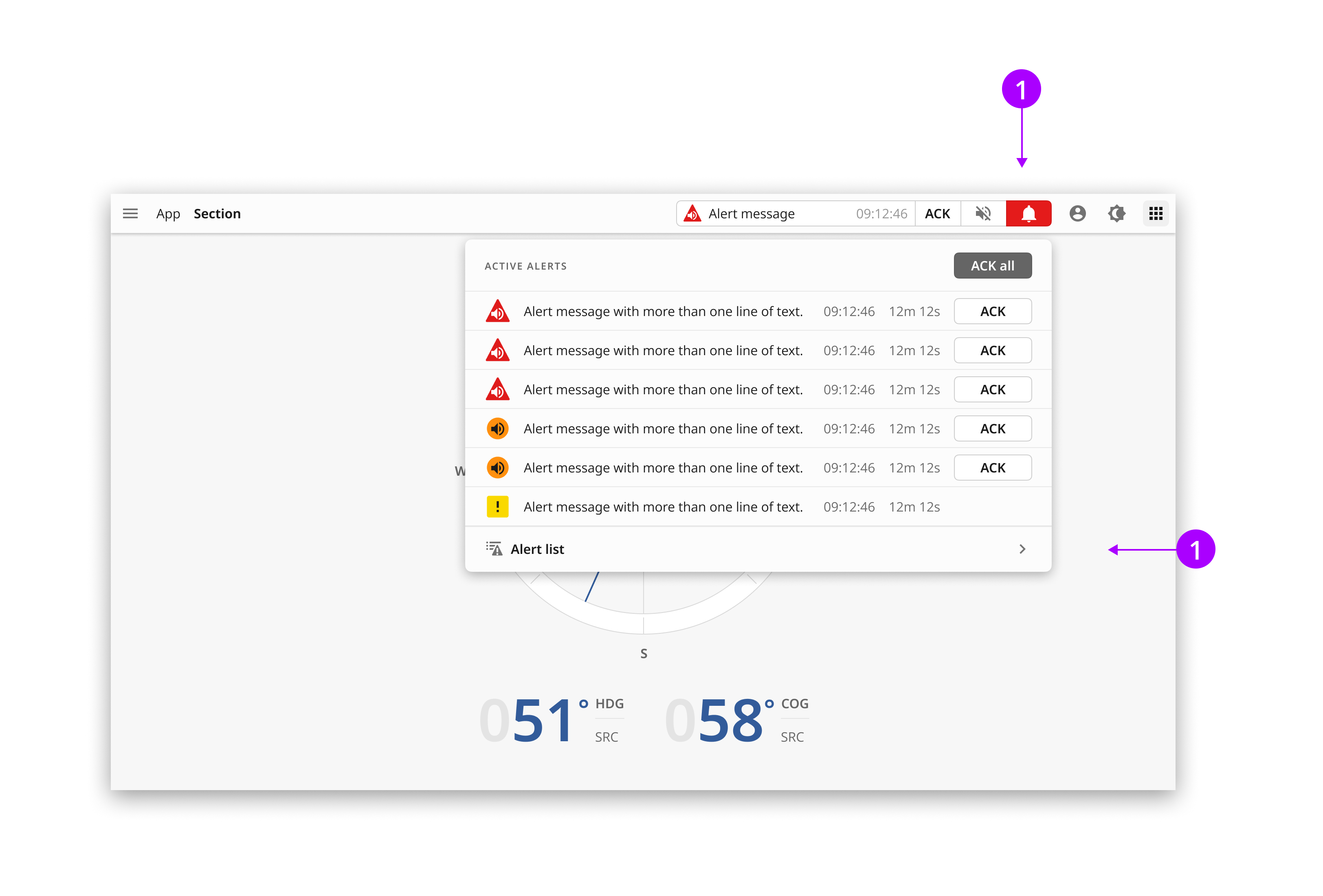
The alert menu
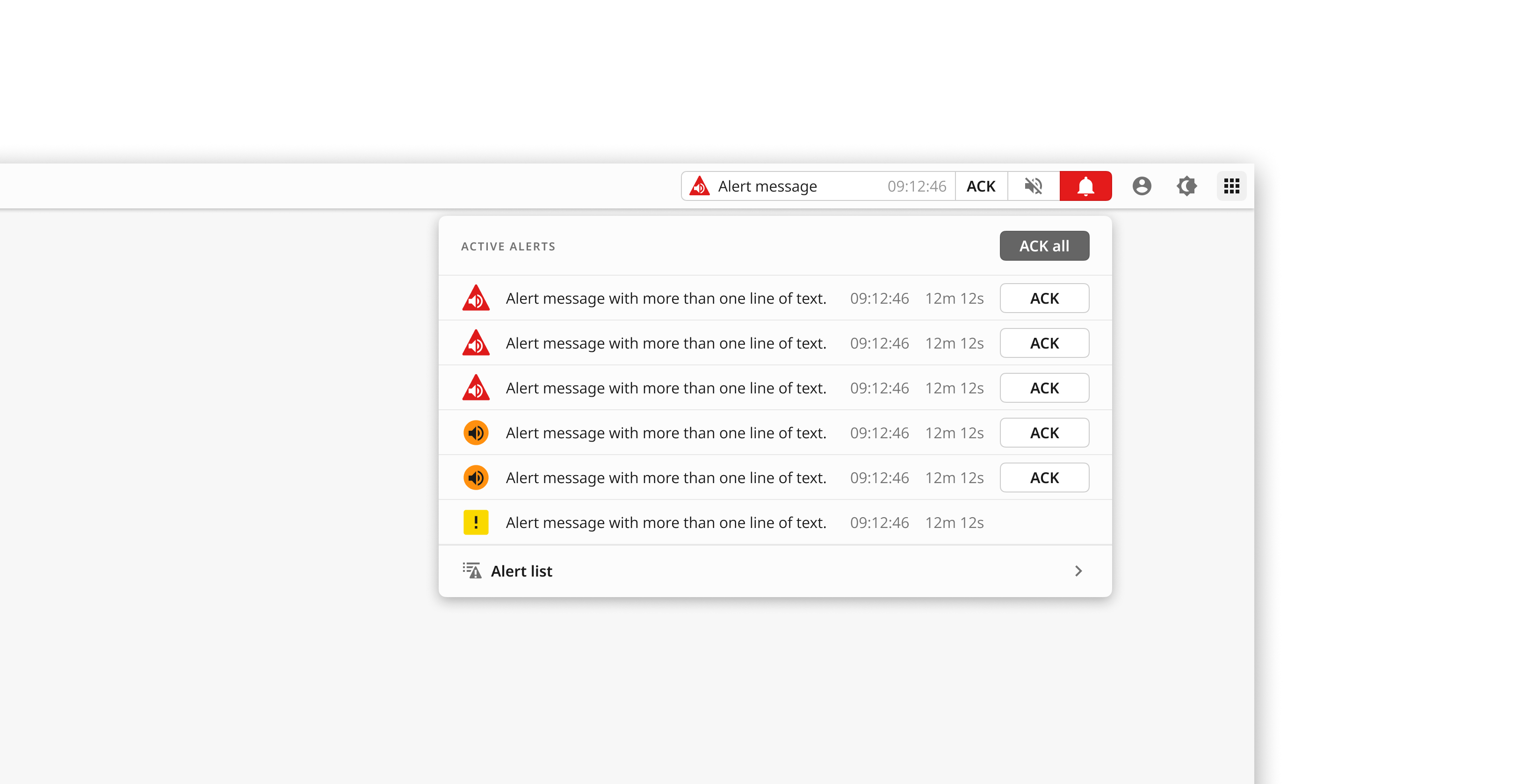
The alert menu can be accessed from the alert button (1). It shows a condensed view of a limited number of alerts. The menu can be removed by clicking on the alert icon again or outside the menu. The menu shows alerts and their status, such as unacknowledgeable alerts (3). In the bottom of the list there is a button linking to the full alert list (4). The button includes a counter of the total number of active alerts in the system. Note: Sometimes such as on very small screens, there is an option to bypass the alert menu to go directly to the full screen alert list, from the alert button.
Accessing the alert list
The alert list shows all alerts in the application in a full screen view. The list can be accessed in two ways. 1 The alert list button in the alert menu. 2 The alert list button in the navigation menu.
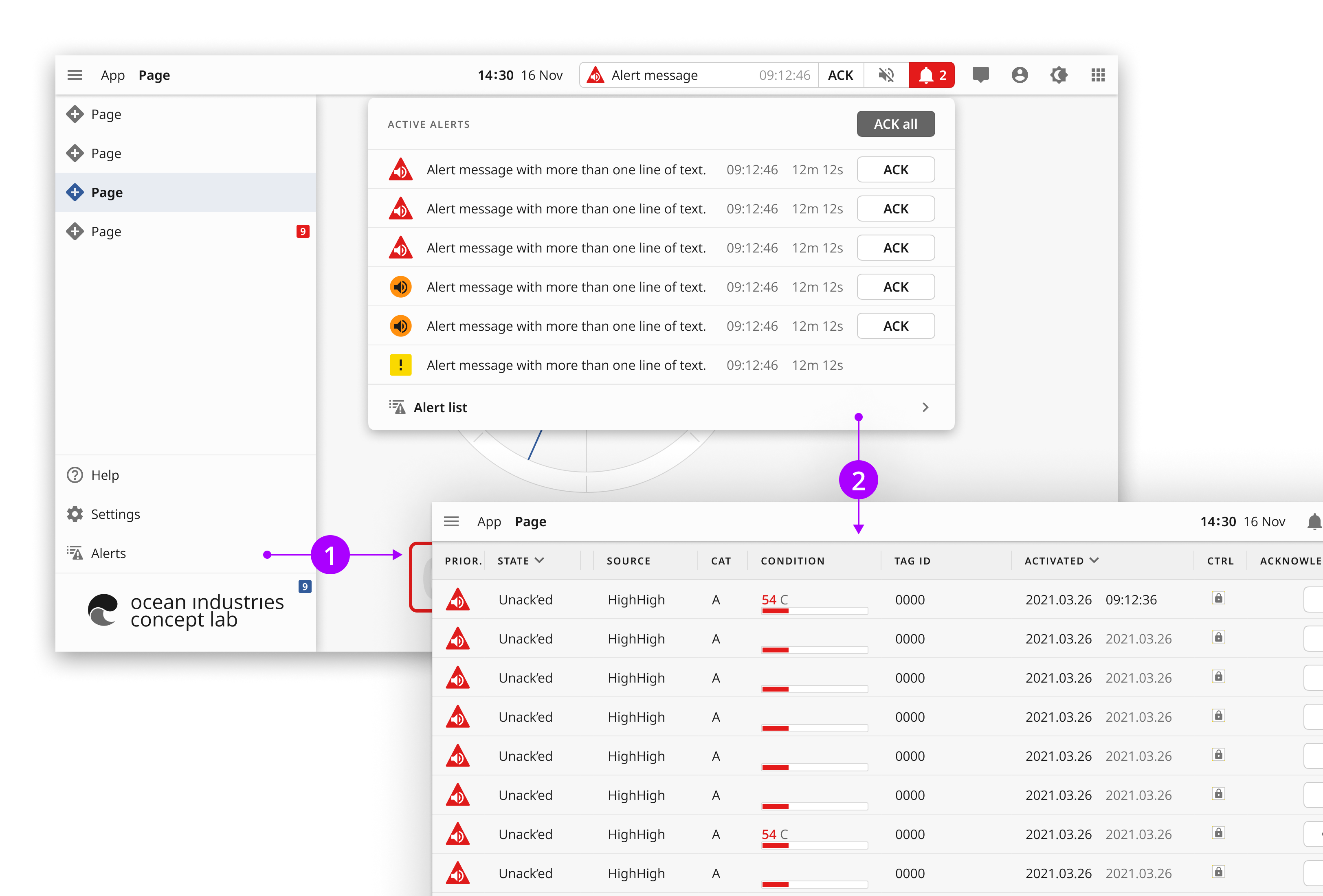
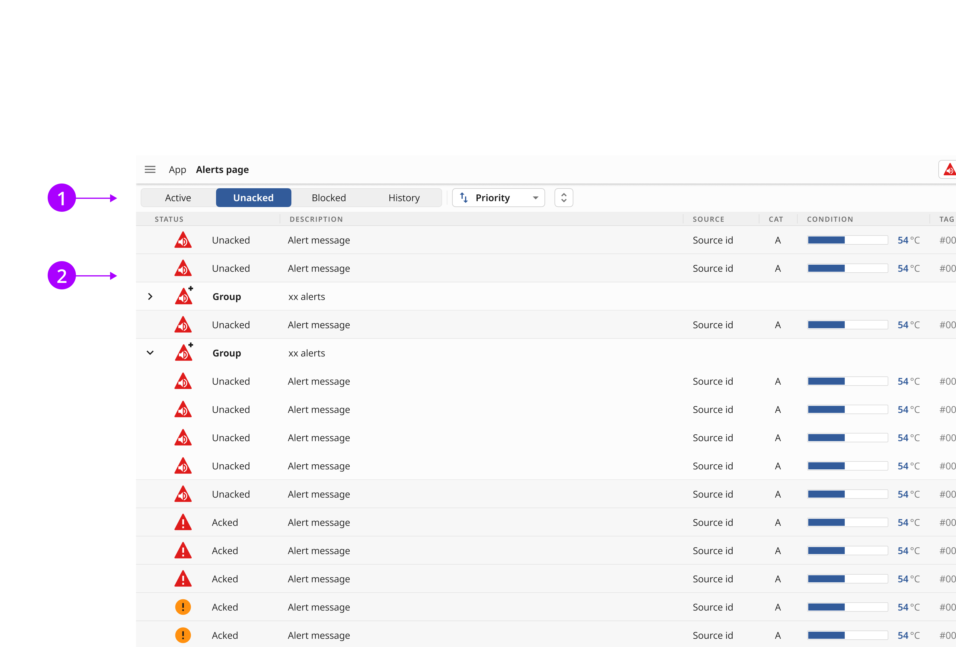
The alert list
The alert list shows all alerts in the applicaton in a single page. The interface shown here is an examlpe of how that could look. In most cases it would include additional functions such as filters. The alert list is using the same design pattern as setting where the hamburger menu button is changed to a close button (1). This has been done to make it easy to get back to the main content from the alert menu and to offer more list space for small screens. This list use standard openbrige table items that allows sorting (2). The alert list items (3) can be configured according to application type.