Styles
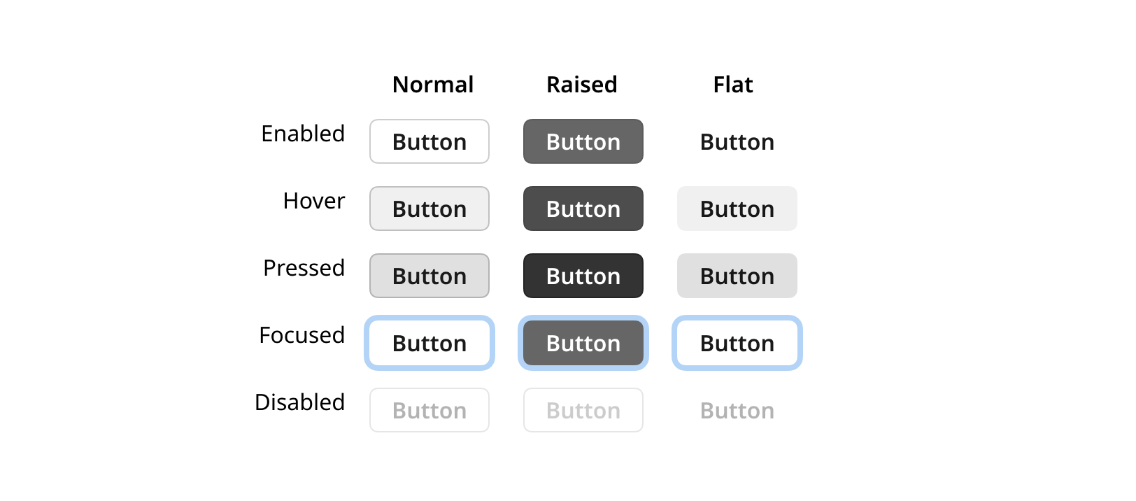
A state is the behavior of an interactive element in various stages of interaction. It will change visual appearance when a mouse cursor is hovering over it or when it is pressed.
The interactive components in OpenBridge is formatted using styles and states.
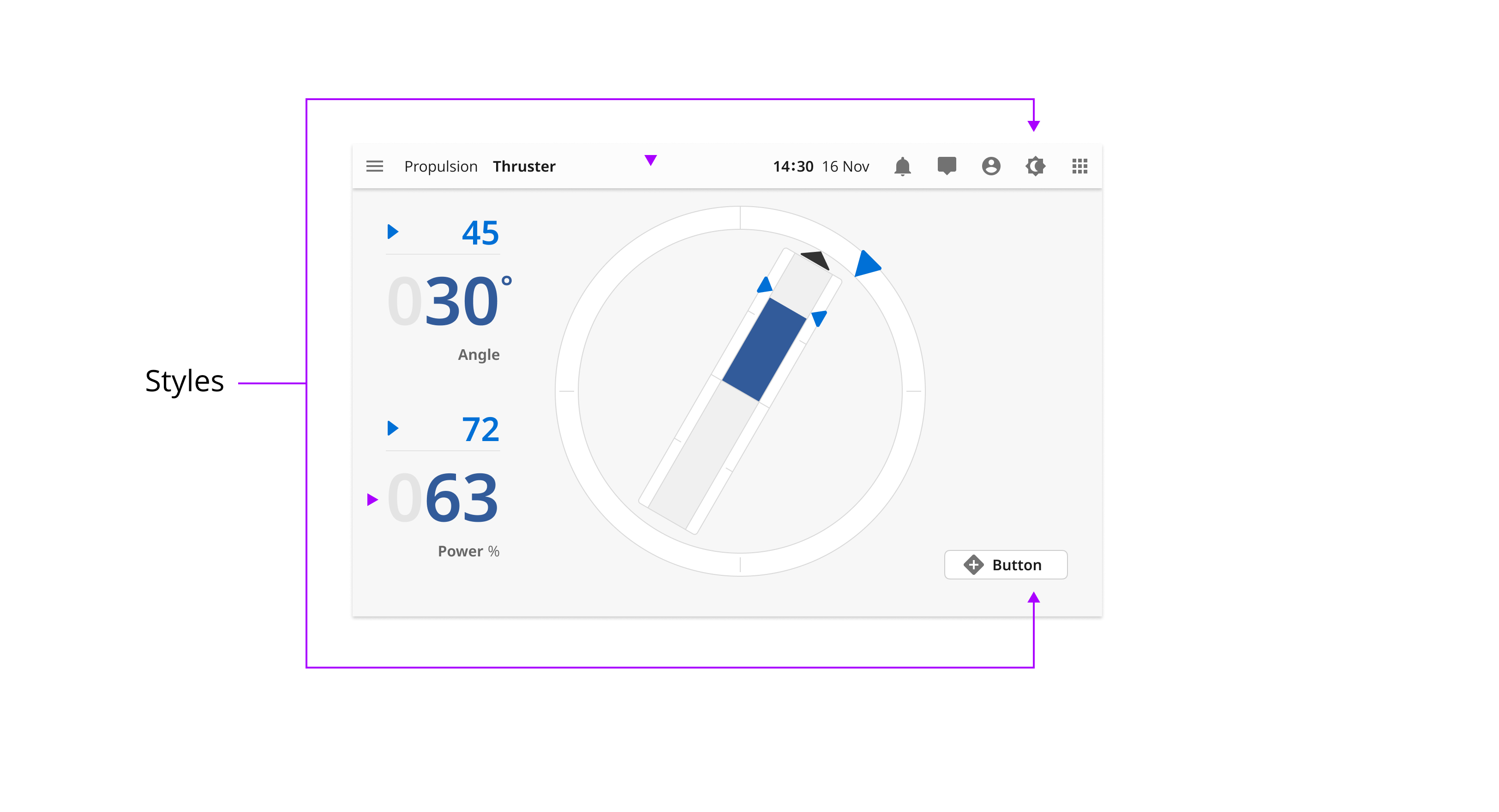
Styles and states
Style set
A style is visual formatting of an interactive element. For instance, a raised button is visually emphasized compared to a normal button. Both of the styles will be affected by changes in interactive states.

States
A state is the behavior of an interactive element in various stages of interaction. It will change visual appearance when a mouse cursor is hovering over it or when it is pressed.
Style elements
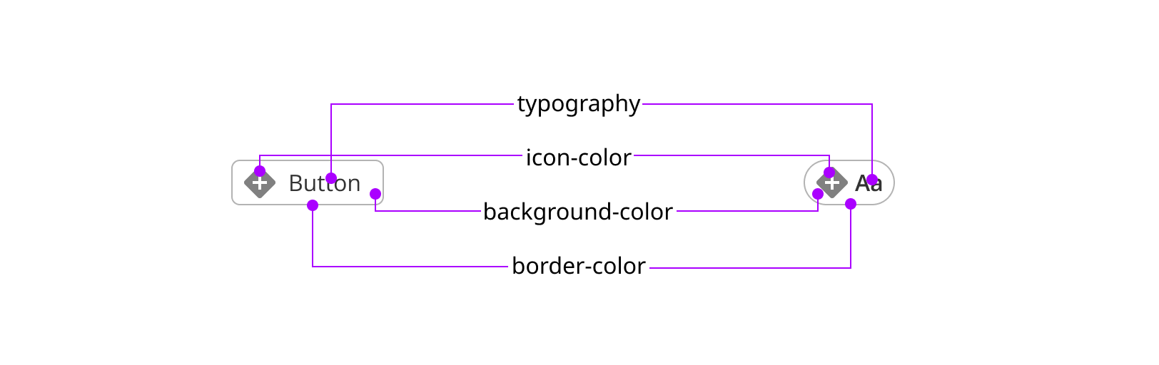
A style is built up by three elements: foreground color, background color and border.
Style definitions
The styles are divided into two main categories; UI styles and Alert styles. A detailed definition of all colors can be found in the Figma palette files below.
UI styles
UI styles are used in interactive elements like Buttons and Toggles where the element has states and shows visual changes to notify the user that the state is changing.
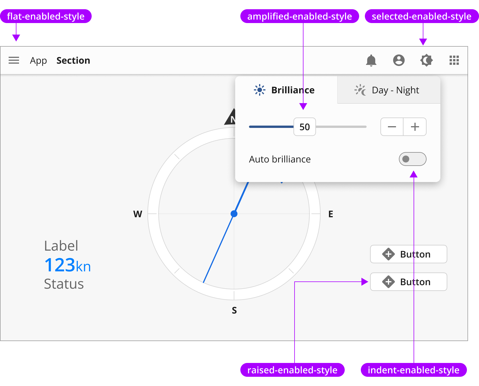
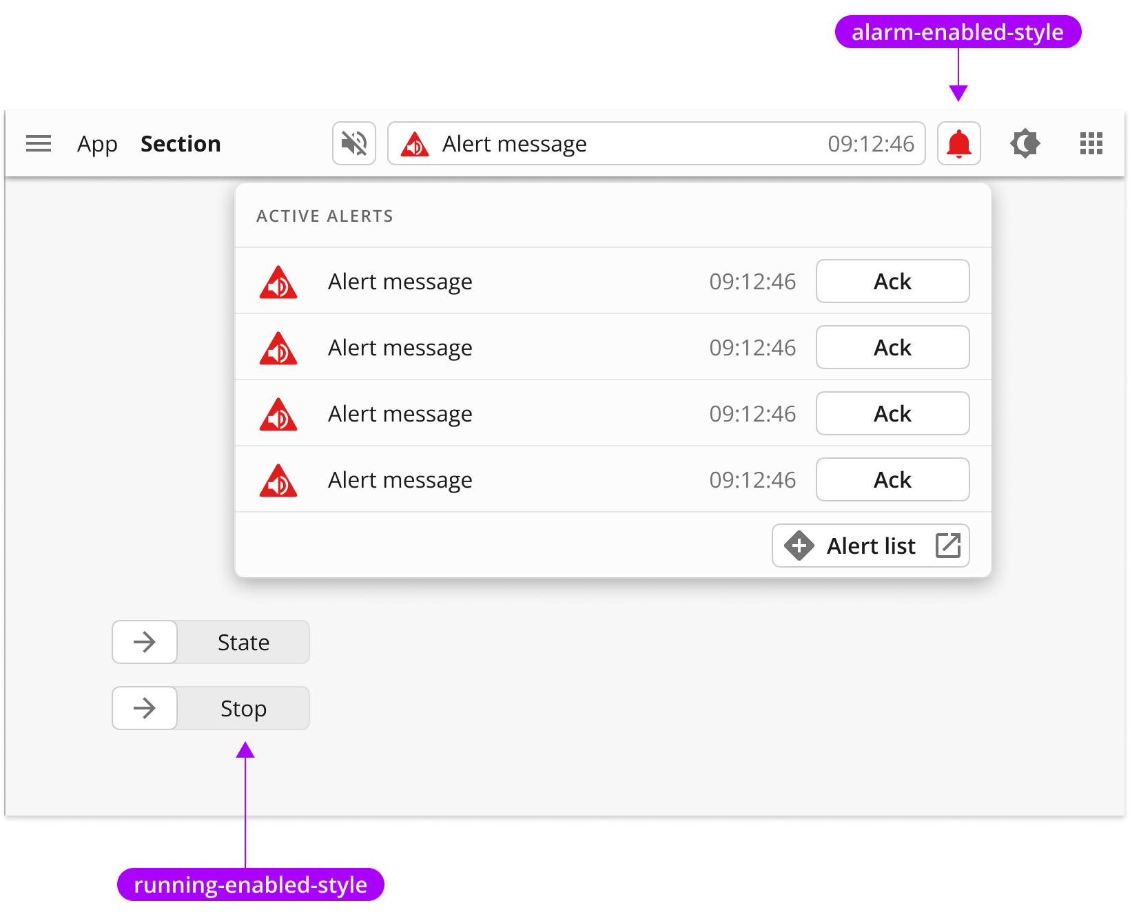
Alert styles
Alert styles are used on interactive components that also can show an alert state.