Topbar
Updated:
February 1, 2020
The top bar are present on all applications and offer a consistent way for accessing critical functions in an application. It consist of a navigation menu, application label aligned to the left. Alarm icon,dimming and palette icon, optional fields and an application launcher are aligned to the right. The optional field include application icons with direct link to programs and a time component.
Variations
The topbar may be displayed in different variations, depending on the type of application and needs for different functions.

Standard topbar
The standard Topbar is the most used version for all full applications.
Standard topbar
The standard Topbar is the most used version for all full applications.

Topbar with app shortcuts
The topbar can contain app shortcuts to related and frequently used applications.
Topbar with app shortcuts
The topbar can contain app shortcuts to related and frequently used applications.

Topbar with clock
A standardised clock may be displayed in the topbar if needed.
Topbar with clock
A standardised clock may be displayed in the topbar if needed.
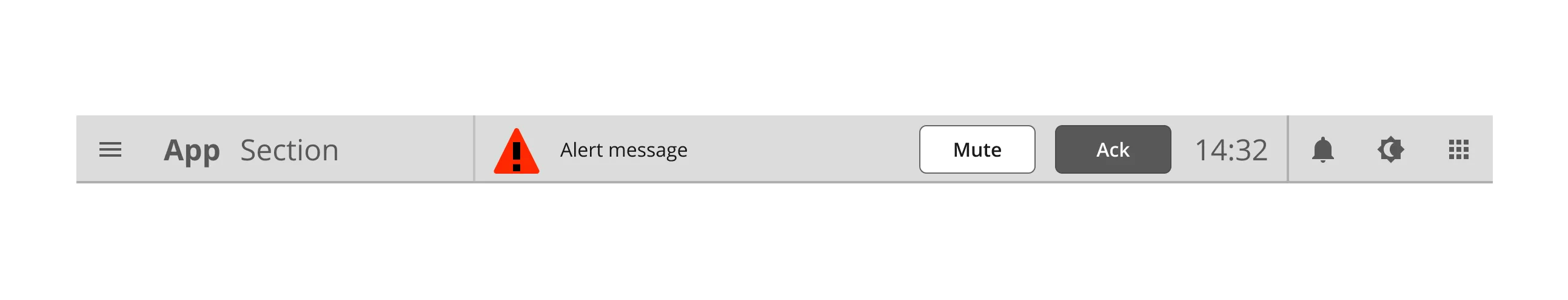
Topbar with alert
Alerts pops up in the topbar.
Topbar with alert
Alerts pops up in the topbar.

Topbar for app settings
The topbar for app settings has a back button, a close button and supports a breadcrumb.
Topbar for app settings
The topbar for app settings has a back button, a close button and supports a breadcrumb.
Component building blocks
How to build the topbar.
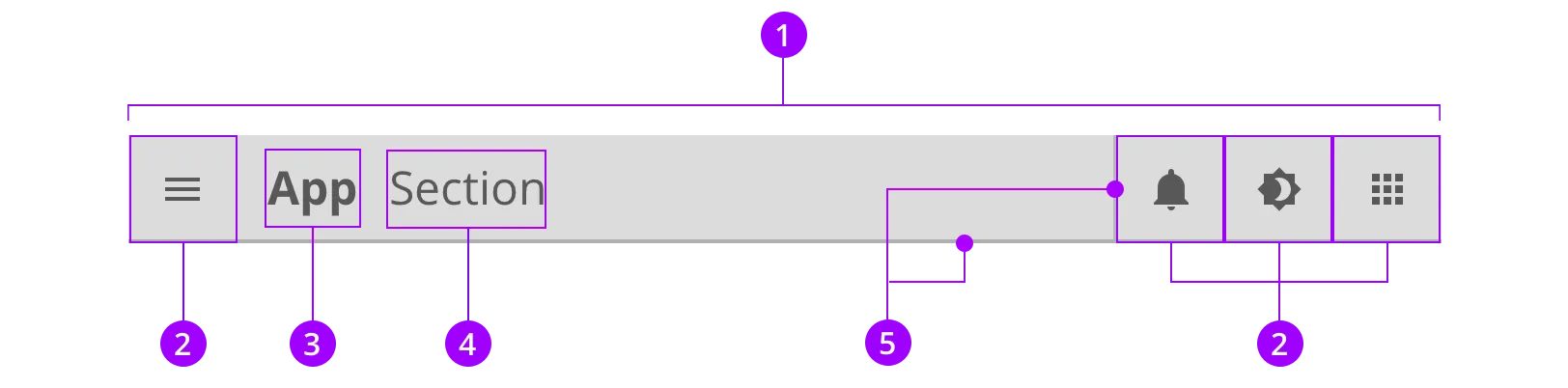
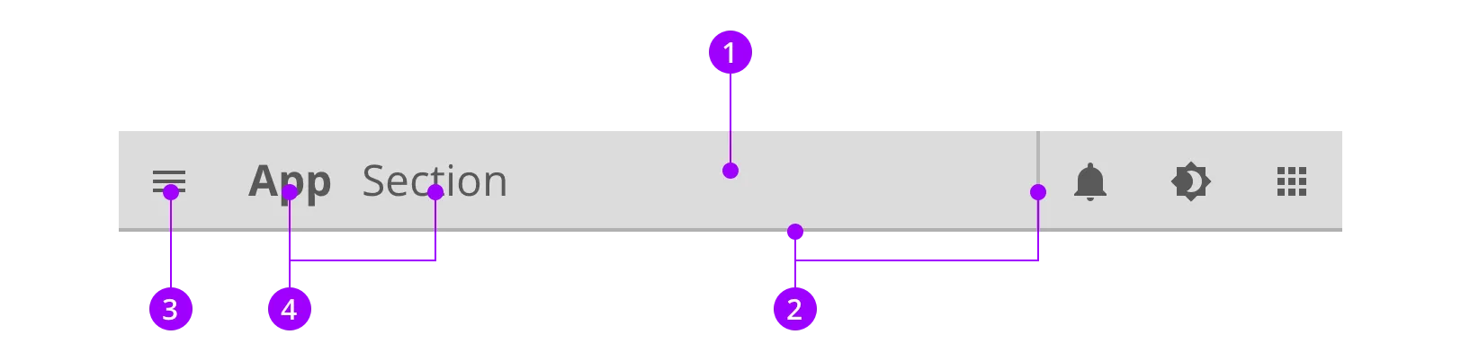
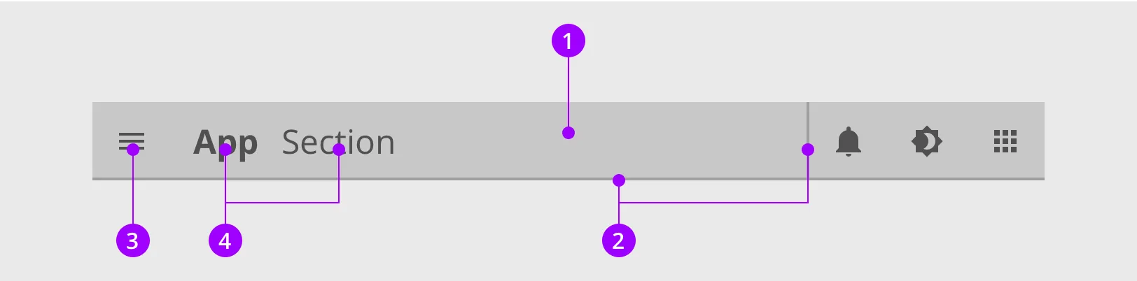
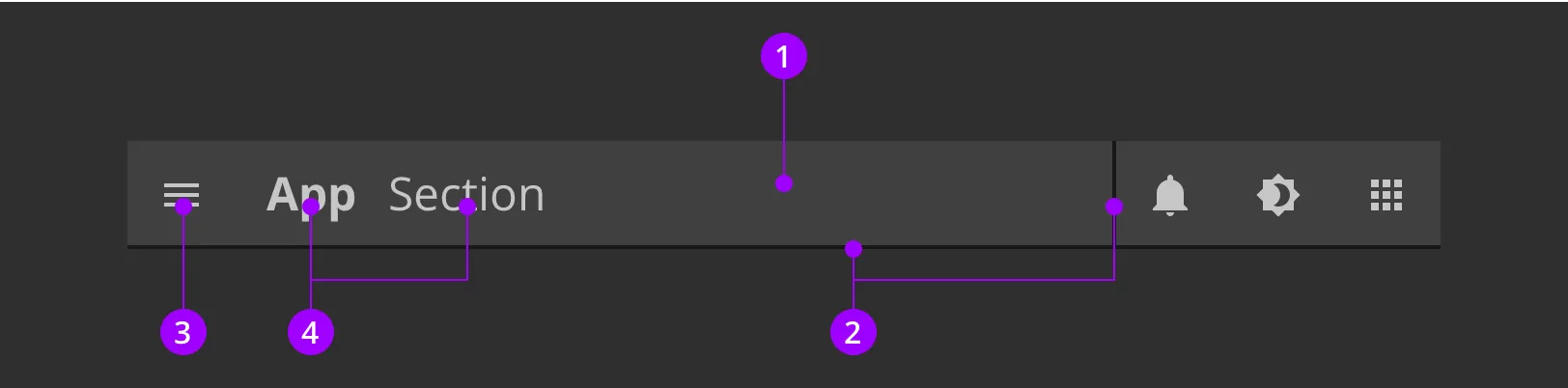
Anatomy
The topbar is a nested component, and contains multiple components.

Colors and styles
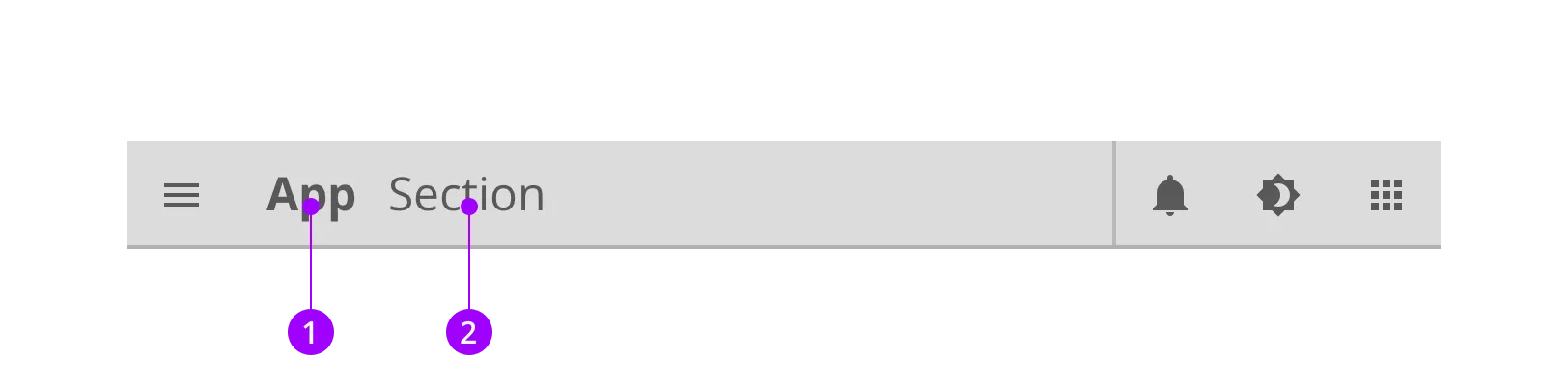
Typography and icons
The label tells you about your location in the application and makes it easy to access other parts.
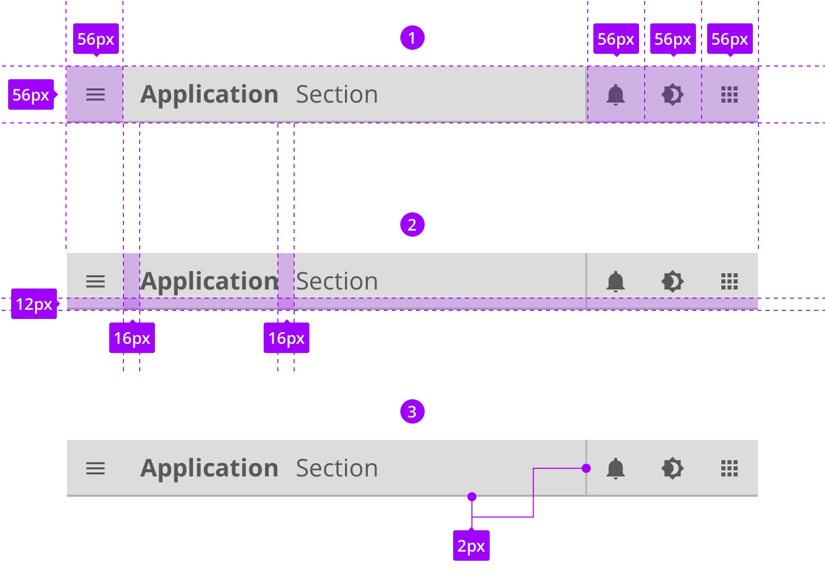
Specs
This component is built up by a oval slider and icons.
